Tuesday, December 23, 2008

Mumbai weekend getaway : Matheran


This weekend we decided to explore Matheran, a small hill station near Mumbai that our friends had told us about for long.
To reach here one can take a train from Dadar to Neral and then get onto a narrow gauge toy-train up into the hills. However, we went via Pune collecting a bunch of old friends driving all the way around Lonavla, Khandala etc.
It was a short two hour drive on the Old Pune Highway which I loved. This route is much scenic in contrast to the mundane Expressway, ofcourse if you have enough time on hand.
Once you reach Matheran, you leave your car at the huge car parking at the entrance. We reached here by afternoon. Unlike the northern hills in India, these hills never get excessively, unbearably cold. The weather here in winters is just perfect for a vacation. We did not have any bookings and am glad about it as the hotels on the internet show a very dreamy picture. Its best to go there and see what suits you and your pocket.
Walking can be a pain for someone who is looking for a luxurious vacation on the hills. But we loved every bit of it. Incase one tires out there is either the horseback or a hand-cart. After a lot of exploration we finally got a place to stay close to the main market. (FYI, the train would drop us at the market itself.) The market has several footwear shops and mini eateries to spend time at.
At the end of the day when you've had your fill all you care for is a goodnight sleep. Mornings are beautiful I suppose like the others said as I spent it getting that extra doze which I can hardly get back home in the city.
We walked around more, exploring the various points mentioned in the guidemap. If one likes spooky settings there are way too many here. Abandoned lodges, hollow tree trunks and the likes. Little nicknacks on the way. Kokam soda, a red colured, sweet and sour drink was interesting and instantly refreshing. There were little games for entertainment like loop the gift, target etc. Almost like a mini fair.
It was time to head back to the car parking before dark. This time we walked along the tracks, taking the train route and this was even more pretty.
Matheran, I say is a breath of fresh air. Almost literally!

Tuesday, December 9, 2008

DesignMembane blog

Helos to all! My studio turns Uno and just to initiate some more meaningful conversations on work and design from DesignMembrane I have started a brand new blog :

http://designmembrane.blogspot.com/


Do let your comments flow in.

P.S. I would still be writing on the SWAT.CH. Analysis about my experiences with life in general.

Tuesday, November 18, 2008

Romancing colours in Pushkar


I'm back yet again from a short and awesome trip to Pushkar in Rajasthan. The annual fair which is primarily an occasion to trade cattle is held a week in advance of the first full moon day in the hindu month of Kartik that falls usually in first week of November.


The name Pushkar comes from an old legend that goes like this...Lord Bhrama (worshipped as the Creator, in hindu mythological belief of trinity of Creator- Preserver- Destroyer : Bhrama-Vishnu- Mahesh) was looking for a place to perform a yagna in his vahana and accidentally the lotus (पुष्प or Pushp in hindi) from his hand fell on earth and at that very point water sprung out forming a lake. There's more to this story but I'd leave for you to find that out once you visit this place.
Bookings in advance for stay are an absolute must around the festival as it is nearly impossible to get a room otherwise.


Like life in an small city in India, mornings begin early and they are lovely here so even if you are a night person you'd rather not miss these. Sitting by the ghats and getting washed in the serene blue hues of the lake is the best take away from here.


In contrast are the striking hues of the mela which is a colour riot.


The streets are a shopper's delight..locale or urban alike.


All cattle is traded and gone away during the first few days of the fair itself.

Flocked by thousands of tourists from all around the world every year, Pushkar is equipped to provide all that one would require!


Time standing still, the colour, life and energy-around the mela and otherwise, makes me want to go back always to the narrow lanes of the lake city of Pushkar.

Wednesday, October 29, 2008

Shubh Deepawali


Warm wishes on Deepawali...the festival of lights that wins over the darkness of evil...

Wednesday, September 3, 2008

Colours of Maldives


I'm on the little island capital of Maldives Islands, Male. Far away from the humdrum of city life back home in India; Zero pollution, quiet and serene. Unlike the regular holidayer or tourist I'm here for work.
Everyday as I walk down the narrow lanes to my temporary new office, it is nice to get a slice of local life on the way. I can't help getting lost in the striking Mediterranean tones which have been freshened up with fresh emulsion in view of the holy month of Ramadan. At the local fishmarket has two huge fish at the entrance that I almost appear like an installation. Only later do I get to know that it is the famous yellow finned Tuna which is sold by the kilo! I look in amazement at the streets being so clean just when a fellow mate tells me everything goes onto the garbage island! An island just for dumping garbage?!
Liqueur is banned in the Maldives due to religious reasons and is available only at resorts or 5-Star hotels. The only piece of nightlife and activity I figure is scooting around in sport cars , sitting by the ocean and drinking Holstein(energy drink). I see most of the waiters around are Bangladeshis. One guy informs me about how he mortgaged and somehow loaned to pay a huge sum to a guy from the embassy to find him a job here. He thought the tourism here would fetch him enough to recover the investment and save up for home. Sadly he has not even been paid salary for the last 3 months. He was desperate and determined to go home but his passport was with the embassy and he could not leave without stuffing their mouth again. He says the embassy even gets commission from the Maldivian government for bringing in workforce. His story is a revelation and there are many more like him on these atolls.
Come Ramadan and the entire city has gone into sleep mode. Not a soul on the street, not a sound, except the little buzz at the port and the ocean breaking on the barricades, it is all too surreal with the tendency of laziness catching up. I meet many locales during work, and lot of youth(you don't get to see the elderly here!). 2 out of every 5 had the same answer to my introductory question "What do you do?"- "Nothing" At first I think its a joke but it is a very fact. With no universities around many Maldivians find work outside their country and the others earn from fishing or simply travel and tourism. Obviously only the fishermen go and fish and if you have a plot of land ..then you've hit the jackpot! You do nothing and life just goes by...
I observe in silence..the turquoise blue shallows and the dark blue hues of the reef that only glitters on the surface.

Wednesday, August 6, 2008

The key behind keys on the keyboard

Ever wondered why keys on your keyboard were never arranged alphabetically? Instead, even today we use the QWERTY keyboard system i.e. the first keys on the top left of the keyboard are Q-W-E-R-T-Y.
This system is said to have evolved from the manner keys were arranged on a typewriter. If you see, all the alphabets T-Y-P-E-W-W-R-I-T-E-R are on the top row of the alphabet keys!
When the first few typewriters came there was no method to typing, we were still learning through hunt and peck. If you ever get your hands on a typewriter you would know how keys can get entangled and jammed if more than one key is pressed at the same time. The QWERTY system reduced jams by slowing you down. It was harder to pile key strokes on top of each other.
Never mind that eight-fingered touch-typing could be a lot faster with a better keyboard, we have learned and evolved our typing skills to be faster with the QWERTY arrangement, as mindless or awkward it may seem.

Tuesday, July 29, 2008

Lovely by Design


Recently, I have been bombarded with tv commercials, full page newspaper advertisements etc., that I cannot help but mention, a new campus on the block: LPU (Lovely Professional University). Anybody from the northern part of India can identify with the "puppy culture" and would instantly guess that it comes from Punjab. But for heavens sake, this is an educational institute that is being projected on a national/global level, why be regionally biased with a name like that! If "Lovely" and "Professional" wasn't good enough "LPU" was highlighted, which isn't any good either. Did somebody think at all about how students would feel associating with that name or what the industry might think about an LPU product? Did nobody think about having a monogram for the university which could reflect the vision and mission or motto before finalising on the beaten to death concept of showing sun rays in the logo? With an identity like that does the institution hold any credibility? With a promising campus and courses like they mention on their neat website it might be a great university which deserves better. But for now the branding stinks!

Monday, July 28, 2008

Designed in India

"After 70 years of independence, an individual in India even today spends an average life, a life trying to make ends meet... worrying about the roof on his head, clothes on his body and food to eat. Who has the time and interest to know what is 'design' and what can it do?

The famous Stefan Sagmeister says "design can touch lives".

Did he mean Indian lives as well..? I mean, thank God it doesn't touch lives as directly as a doctor can otherwise most designers here would be in jail.
"

A seemingly harmless chat with a friend also a product designer, left me thinking hard for self defense. I know this country has a long way to go to set things in order where there is chaos, dirt, pollution and terrorism to deal with high on priority.
But how does one tell this country of millions and some self proclaimed DTP operators who call themselves designers, that it is criminal to do so. A rangoli floor pattern, or somehow just fitting text together with a picture in an advertisement or poster is not design, nor is, as resourceful as it may sound, using washing machines in Ludhiana (Punjab) to make lassi (a drink made from churning curd and milk). Design is also not something 'phoren' or something luxurious or even exotic. Aping the west might make it look slick, but neither is it authentic nor effective in the same context as India. And believe it or not, good design isn't always expensive either. Look at how cheap and efficient is the famous, tiffin service or the dabbawallas in Mumbai function.
Design is not just about creating a pretty picture nor is it just about function. It is a sensitive activity of creating that fine balance between the two. The good news is that more and more people are now willing to 'experiment' with design as they can see its long term benefits.
Just as new is the concept of design here, India is by itself charming, incredible, exotic and chaotic to an outsider. Nobody really has an idea as to what this country really is. Tourists visit India and pick up pretty pictures called miniatures, if fascinated by the hindi language they pick abuses first, local travel and they have no idea whatsoever.
I wanted to showcase my country through a range of memorabilia that was designed and illustrated for a Delhi based design studio during my diploma project in 2006. Here is what I found was available in markets and at tourist destinations and was projected as being Indian...


Manish Arora's projection of India as a Kitch culture


Pop Ganesha bags


Tantra's tees


A land of snake charmers

I saw images and images that were India of course but I truly believed the real India lay behind the exotica and kitch. When the image and symbolism in this country is considered sacred (tantra for example) then it must definately go beyond the image and be able to communicate inforamtion that is engaging and enlightening.
After studying and researching on the Indian visual culture I came up with a set of illustrations with brief narratives that took the visuals beyond the context of a mere image.
I do hope they can touch somebody ..somewhere...


"
Ambassador of India", "Auto", "For Hire", "Welcome, Keep Distance": T-shirts, "Table mats with Hindi proverbs", " Mouse pads depicting games of Indian origin inspired from Indian folk art", "Calender deconstructing miniature painting's popular subject of different moods of love with reference to the heroine or the Ashtanayikas", iconic badges and many more.

It's time Indians take pride in who they are, where they come from and design needs to develop and evolve into a language that can be placed on the globe and is truly made in India.

Friday, July 11, 2008

Identity Crisis

All businesses are like individual identities, living, breathing, growing, with their unique individual characteristics just like us. Then how can a logo of a company as we so talk about, be just another mark?
Even we get bored of our looks so we go to a saloon to get a haircut or buy a new wardrobe that suits our persona, similarly when the ideologies of a company get old and are replaced by new and fresh ones, its identity gets dated and it needs to go for a makeover that can suit its current goals, aspirations and achievements. A logo for its company, is thus not just a mark, it is its identity. It speaks for what the company is and does, positions it correctly and at times, is a silent salesman.
More and more companies and individuals are rising to this fact today. While others are confused what to say, a creative must have the ability to step into the shoes of the client to understand what is required and bring out 'the big idea' (this has to be in not more that one single word or phrase!) and build around it. The result (not necessarily the design process), in all probability would surely be simple, classic and hopefully something that works in the long run.
Recently at DesignMembrane, our cohesive efforts (us+client) have resulted in a slight shift in brand positioning at Kale Consultants, who are a leader in the field of airlines, logistics, travel and IT. The company's identity, though a well-respected and identifiable name failed to show the precision and quality that one can see in their activities and work culture. The Kale globe did not look well- integrated as a form and held no meaning as such for the people associated with the company.


Kale's previous identity

Here's how the new identity was arrived at, altering the form to an extent that it looked evolved and still be identifiable.


Integrating infinite possibilities/ opportunities/solutions


Evolution of form to the final look


Colour scheme became a modern palette, type was also changed to suit the new look. The orange and blue hues represent the horizon. We used Helvetica Nueue for the tag line. The characters for KALE also in helvetica nueue looked taller and were streamlined to overcome the weight imbalance. Other variations in colour and black and white for web, print, for screen viewing and in reduction were also created to maintain consistency across all media.
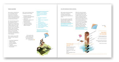
This change in identity has called for an overhauling of all coporate stationery and collaterals. Here is an example of the corporate brochure from what it was in the past to its fresh new avtar.


Then and Now

Client : Kale Consultants
Courtesy: DesignMembrane


A kite being used as a metaphor for aspirations. The catalogue opens with these words by Lauren Bacall: "Imagination is the highest kite one can fly"
The new look certainly positioned the company a level above "the me-too" clutter of other companies within the segment and is more appealing to its staff and associates. The pride they take in owning this new look gives us the belief that it is here to stay and resonate what Kale Consultants is as a brand.