Even we get bored of our looks so we go to a saloon to get a haircut or buy a new wardrobe that suits our persona, similarly when the ideologies of a company get old and are replaced by new and fresh ones, its identity gets dated and it needs to go for a makeover that can suit its current goals, aspirations and achievements. A logo for its company, is thus not just a mark, it is its identity. It speaks for what the company is and does, positions it correctly and at times, is a silent salesman.
More and more companies and individuals are rising to this fact today. While others are confused what to say, a creative must have the ability to step into the shoes of the client to understand what is required and bring out 'the big idea' (this has to be in not more that one single word or phrase!) and build around it. The result (not necessarily the design process), in all probability would surely be simple, classic and hopefully something that works in the long run.
Recently at DesignMembrane, our cohesive efforts (us+client) have resulted in a slight shift in brand positioning at Kale Consultants, who are a leader in the field of airlines, logistics, travel and IT. The company's identity, though a well-respected and identifiable name failed to show the precision and quality that one can see in their activities and work culture. The Kale globe did not look well- integrated as a form and held no meaning as such for the people associated with the company.

Kale's previous identity
Here's how the new identity was arrived at, altering the form to an extent that it looked evolved and still be identifiable.

Integrating infinite possibilities/ opportunities/solutions

Evolution of form to the final look

Colour scheme became a modern palette, type was also changed to suit the new look. The orange and blue hues represent the horizon. We used Helvetica Nueue for the tag line. The characters for KALE also in helvetica nueue looked taller and were streamlined to overcome the weight imbalance. Other variations in colour and black and white for web, print, for screen viewing and in reduction were also created to maintain consistency across all media.
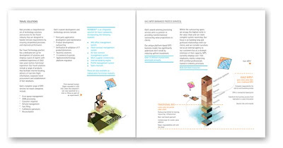
This change in identity has called for an overhauling of all coporate stationery and collaterals. Here is an example of the corporate brochure from what it was in the past to its fresh new avtar.

Then and Now
Client : Kale Consultants
Courtesy: DesignMembrane


A kite being used as a metaphor for aspirations. The catalogue opens with these words by Lauren Bacall: "Imagination is the highest kite one can fly"
The new look certainly positioned the company a level above "the me-too" clutter of other companies within the segment and is more appealing to its staff and associates. The pride they take in owning this new look gives us the belief that it is here to stay and resonate what Kale Consultants is as a brand.
2 comments:
Nice project description. Liked the way you have made the analysis public. Looking forward to more similar posts.
Thanks Gaurang. I do hope to share more on this blog soon..you are most welcome with your comments..
Post a Comment