Tuesday, July 29, 2008

Lovely by Design


Recently, I have been bombarded with tv commercials, full page newspaper advertisements etc., that I cannot help but mention, a new campus on the block: LPU (Lovely Professional University). Anybody from the northern part of India can identify with the "puppy culture" and would instantly guess that it comes from Punjab. But for heavens sake, this is an educational institute that is being projected on a national/global level, why be regionally biased with a name like that! If "Lovely" and "Professional" wasn't good enough "LPU" was highlighted, which isn't any good either. Did somebody think at all about how students would feel associating with that name or what the industry might think about an LPU product? Did nobody think about having a monogram for the university which could reflect the vision and mission or motto before finalising on the beaten to death concept of showing sun rays in the logo? With an identity like that does the institution hold any credibility? With a promising campus and courses like they mention on their neat website it might be a great university which deserves better. But for now the branding stinks!

Monday, July 28, 2008

Designed in India

"After 70 years of independence, an individual in India even today spends an average life, a life trying to make ends meet... worrying about the roof on his head, clothes on his body and food to eat. Who has the time and interest to know what is 'design' and what can it do?

The famous Stefan Sagmeister says "design can touch lives".

Did he mean Indian lives as well..? I mean, thank God it doesn't touch lives as directly as a doctor can otherwise most designers here would be in jail.
"

A seemingly harmless chat with a friend also a product designer, left me thinking hard for self defense. I know this country has a long way to go to set things in order where there is chaos, dirt, pollution and terrorism to deal with high on priority.
But how does one tell this country of millions and some self proclaimed DTP operators who call themselves designers, that it is criminal to do so. A rangoli floor pattern, or somehow just fitting text together with a picture in an advertisement or poster is not design, nor is, as resourceful as it may sound, using washing machines in Ludhiana (Punjab) to make lassi (a drink made from churning curd and milk). Design is also not something 'phoren' or something luxurious or even exotic. Aping the west might make it look slick, but neither is it authentic nor effective in the same context as India. And believe it or not, good design isn't always expensive either. Look at how cheap and efficient is the famous, tiffin service or the dabbawallas in Mumbai function.
Design is not just about creating a pretty picture nor is it just about function. It is a sensitive activity of creating that fine balance between the two. The good news is that more and more people are now willing to 'experiment' with design as they can see its long term benefits.
Just as new is the concept of design here, India is by itself charming, incredible, exotic and chaotic to an outsider. Nobody really has an idea as to what this country really is. Tourists visit India and pick up pretty pictures called miniatures, if fascinated by the hindi language they pick abuses first, local travel and they have no idea whatsoever.
I wanted to showcase my country through a range of memorabilia that was designed and illustrated for a Delhi based design studio during my diploma project in 2006. Here is what I found was available in markets and at tourist destinations and was projected as being Indian...


Manish Arora's projection of India as a Kitch culture


Pop Ganesha bags


Tantra's tees


A land of snake charmers

I saw images and images that were India of course but I truly believed the real India lay behind the exotica and kitch. When the image and symbolism in this country is considered sacred (tantra for example) then it must definately go beyond the image and be able to communicate inforamtion that is engaging and enlightening.
After studying and researching on the Indian visual culture I came up with a set of illustrations with brief narratives that took the visuals beyond the context of a mere image.
I do hope they can touch somebody ..somewhere...


"
Ambassador of India", "Auto", "For Hire", "Welcome, Keep Distance": T-shirts, "Table mats with Hindi proverbs", " Mouse pads depicting games of Indian origin inspired from Indian folk art", "Calender deconstructing miniature painting's popular subject of different moods of love with reference to the heroine or the Ashtanayikas", iconic badges and many more.

It's time Indians take pride in who they are, where they come from and design needs to develop and evolve into a language that can be placed on the globe and is truly made in India.

Friday, July 11, 2008

Identity Crisis

All businesses are like individual identities, living, breathing, growing, with their unique individual characteristics just like us. Then how can a logo of a company as we so talk about, be just another mark?
Even we get bored of our looks so we go to a saloon to get a haircut or buy a new wardrobe that suits our persona, similarly when the ideologies of a company get old and are replaced by new and fresh ones, its identity gets dated and it needs to go for a makeover that can suit its current goals, aspirations and achievements. A logo for its company, is thus not just a mark, it is its identity. It speaks for what the company is and does, positions it correctly and at times, is a silent salesman.
More and more companies and individuals are rising to this fact today. While others are confused what to say, a creative must have the ability to step into the shoes of the client to understand what is required and bring out 'the big idea' (this has to be in not more that one single word or phrase!) and build around it. The result (not necessarily the design process), in all probability would surely be simple, classic and hopefully something that works in the long run.
Recently at DesignMembrane, our cohesive efforts (us+client) have resulted in a slight shift in brand positioning at Kale Consultants, who are a leader in the field of airlines, logistics, travel and IT. The company's identity, though a well-respected and identifiable name failed to show the precision and quality that one can see in their activities and work culture. The Kale globe did not look well- integrated as a form and held no meaning as such for the people associated with the company.


Kale's previous identity

Here's how the new identity was arrived at, altering the form to an extent that it looked evolved and still be identifiable.


Integrating infinite possibilities/ opportunities/solutions


Evolution of form to the final look


Colour scheme became a modern palette, type was also changed to suit the new look. The orange and blue hues represent the horizon. We used Helvetica Nueue for the tag line. The characters for KALE also in helvetica nueue looked taller and were streamlined to overcome the weight imbalance. Other variations in colour and black and white for web, print, for screen viewing and in reduction were also created to maintain consistency across all media.
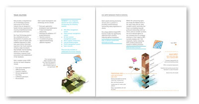
This change in identity has called for an overhauling of all coporate stationery and collaterals. Here is an example of the corporate brochure from what it was in the past to its fresh new avtar.


Then and Now

Client : Kale Consultants
Courtesy: DesignMembrane


A kite being used as a metaphor for aspirations. The catalogue opens with these words by Lauren Bacall: "Imagination is the highest kite one can fly"
The new look certainly positioned the company a level above "the me-too" clutter of other companies within the segment and is more appealing to its staff and associates. The pride they take in owning this new look gives us the belief that it is here to stay and resonate what Kale Consultants is as a brand.